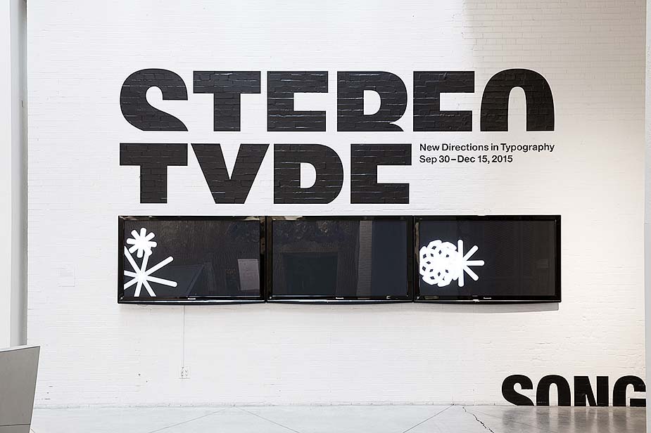
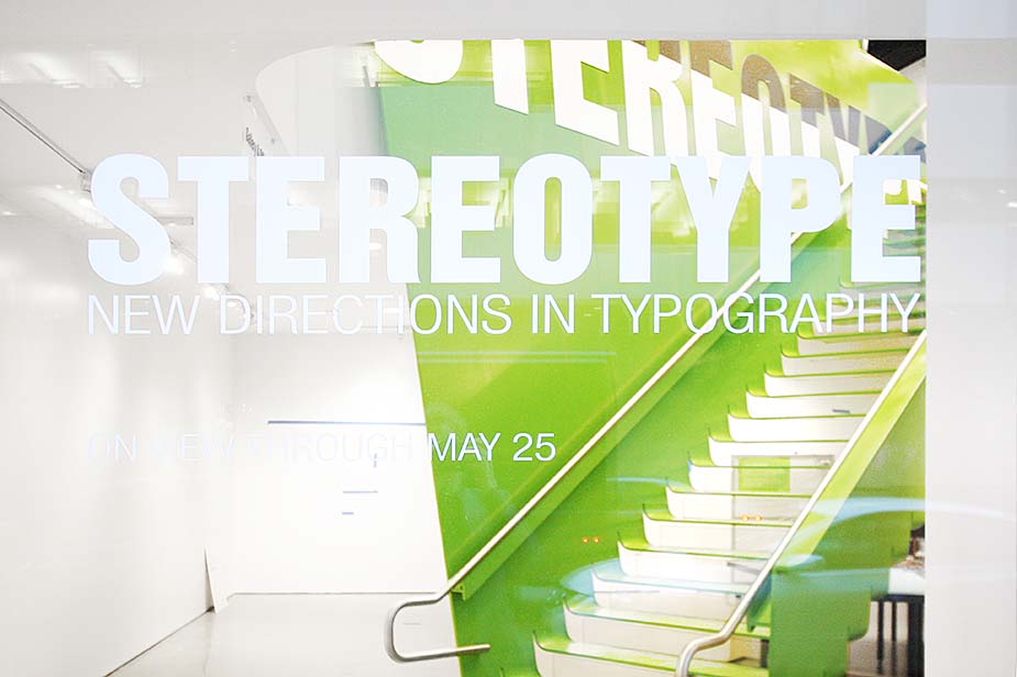
1/11
Masashi Kawamura's rayon & cotton T shirts relate typography to the human body with five familiar fonts: helvetica, caslon, baskerville, courier & cooper black. ©Remco for EDHV
2/11
While each character has gravity, the alphabets of Stereotype are the result of iterative processes, and the linearity and large size of the displays literalize the serial nature of the work, encouraging visitors to compare, and spend more time with each designer. Here a linear display case for Jerome Corgier, Is It Still Type?, 2001. ©Marc Tatti
3/11
Designer names mark their territories & minimal framing allows for the most direct, unmediated experience of the work possible. ©Marc Tatti
4/11
As possible, RL maximized visitor contact with the work through eye-level mounting without enclosure as with Brian Banton’s blended alphabet Heterosis Typeface, 2001. ©Marc Tatti
5/11
Title wall at the RL-designed Sheila Johnson Design Center, Aronson Gallery at Parsons School of Design (Aug 14 - Sep 16, 2015) with Song Hyan Ju's The Moment at which we were lost for words, 2012. ©Marc Tatti
6/11
RL created graphics to bind the show to its changing gallery circumstance, using designer names to mark their territories, and designed an alphabet of chunky graphic displays to accommodate the works. ©Marc Tatti
7/11
Ji Lee’s alphabet (left) can be viewed left to right or right to left, stacked or spun and we used axial mounts and iPads to help visitors unpack her concept and process. Some works allowed for minimal protection & were best viewed down low as with Dominique Falla's alphabet (right). ©Stewart Clements
8/11
EDVH, Ashes to Ashes, 2005 burned live as a performance in the gallery with the remains entombed in a vitrine - a frustrating compromise. The cantilever of this fallen L-character table is meant to amplify a sense of vulnerability. ©Rice+Lipka Architects
9/11
RL physicalized digital content by projecting video works on wall boxes to keep them in the chunky display family. Dan Tobin Smith, Alphabet, 2005. ©Stewart Clements
10/11
There were a couple of exceptions to physicalizing digital works. We projected nano-scientists' Mason and Hernandez's Colloidal Alphabet Soup on the floor in circular form that allowed people to more communally experience their microscopic letters, usually experienced through a microscope lens. ©Marc Tatti
11/11
The exhibition opened at the Boston Society of Architect in 2014 and traveled to multiple venues. RL integrated robust graphics to bind the show to its gallery context. ©Rice+Lipka Architects

STEREOTYPE

Boston Society of Architects, Multiple Venues

Proposal 2013
Project 2014
Completion 2014

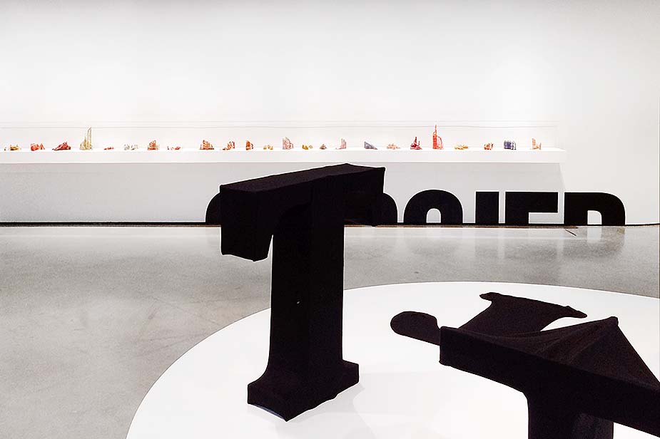
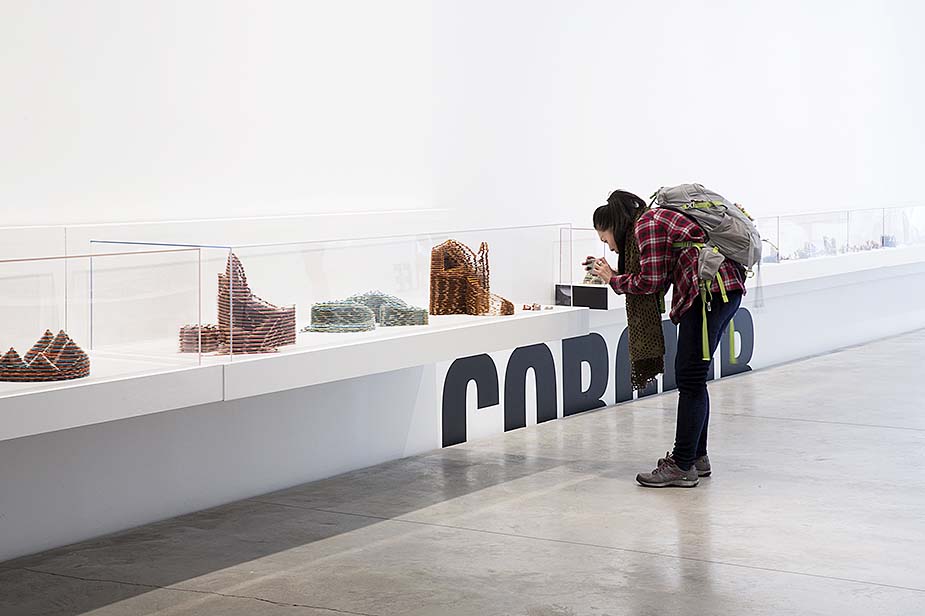
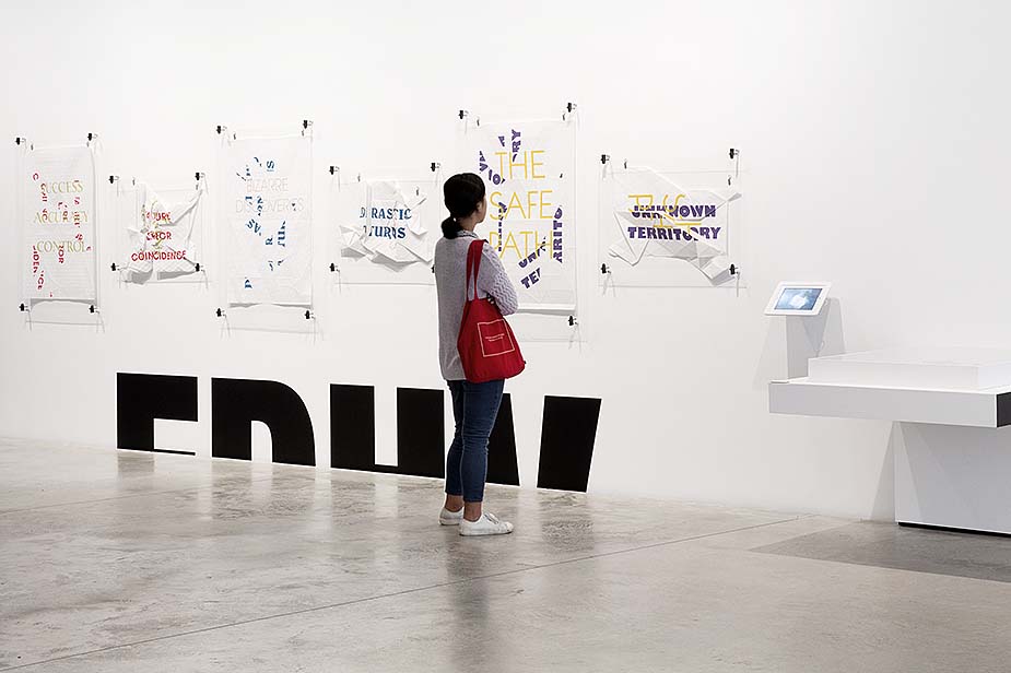
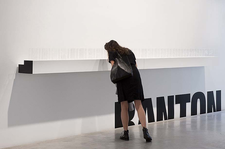
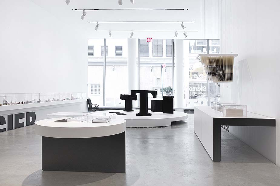
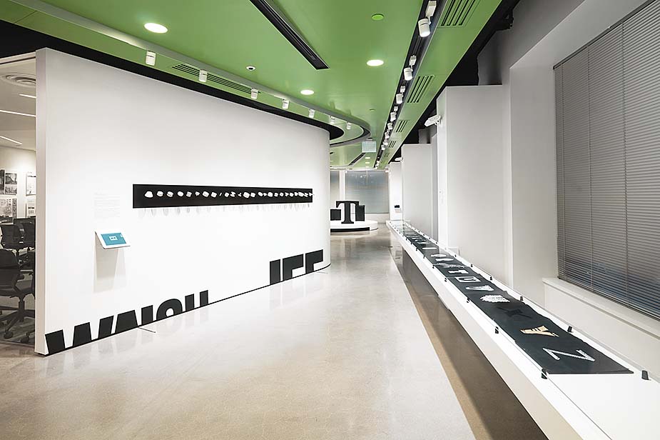
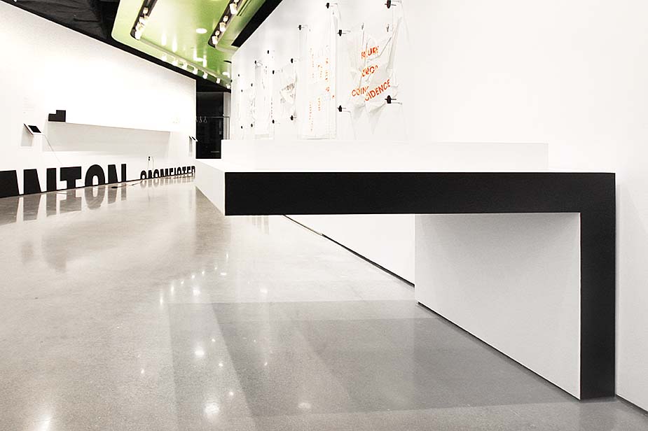
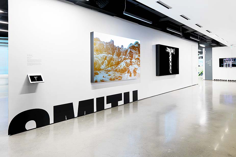
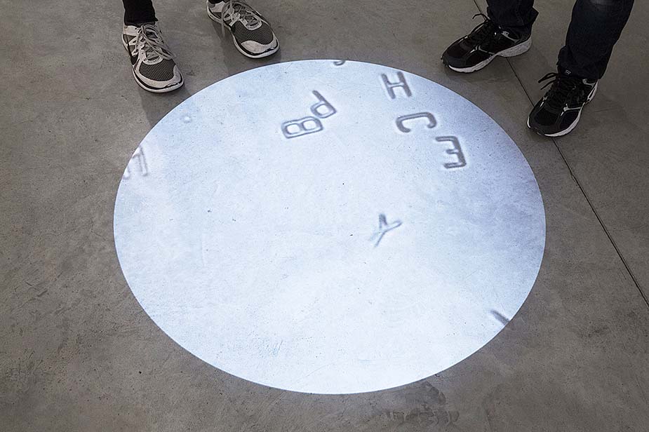
Stereotype: New Directions in Typography presents work from a group of designers pushing perceptions about type to accommodate the digital and experiential through pioneering explorations in motion typography. The exhibition opened at the Boston Society of Architects in 2014, and traveled to the Selby Gallery, Parsons School of Design, and the Richard Peeler Art Center in 2016. Its planned lack of a consistent physical situation and curatorial divisions suggested to us a means of display with a presence robust enough to unify the body of work as a whole even in diverse contexts.

We created graphics to bind the show to its changing gallery circumstance, using designer names to mark their territories, and designed an alphabet of chunky graphic displays to accommodate the works. Working with the BSA and Curator Squared, RL used duplicate works, digital displays, and minimal framing to allow the most direct, unmediated experience of the work possible. Preceded by important exhibitions from a stance within the field, StereoType takes an approach in which conceptual and performance art and even science are the progenitors of ways to re-think typography in a digital age.

Rice+Lipka Architects
Principals: Lyn Rice & Astrid Lipka
Lead Designer: Taylor McNally-Anderson
Project Team: Alexander Crean

Curators: C2/Ginger Gregg Duggan & Judith Hoos Fox